Rick & Sharon’s Garnet Valley Kitchen Remodel
Dream → Design → Build with First State Building & Design
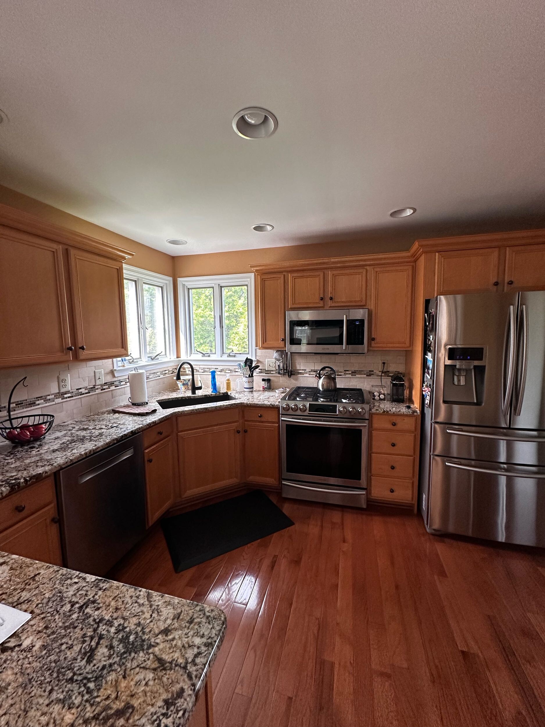
Rick and Sharon’s Garnet Valley Kitchen was fine, but their kitchen no longer supported how they used the space day to day. The original U-shaped layout limited movement, the countertops felt visually busy, and the maple cabinetry made the room appear darker than it really was. Storage was workable, but not optimized, and the flow simply wasn’t as efficient as it could be.
They weren’t looking to tear down walls or dramatically reconfigure the entire room. What they wanted was a kitchen that felt brighter, more organized, and easier to use—something clean, timeless, and aligned with how they live now.
And that’s exactly where our Dream → Design → Build process began.
Dream: Understanding How Rick & Sharon Live
Every kitchen remodel starts with listening.
During our first visit, we learned:
- Sharon gravitates toward bright, timeless traditional finishes, nothing too trendy, but clean and uplifting.
- Rick values practical function: a better cooking workflow, improved storage, and reliable lighting.
- They both wanted a kitchen that felt bigger, brighter, and less cluttered without removing walls or altering the footprint.
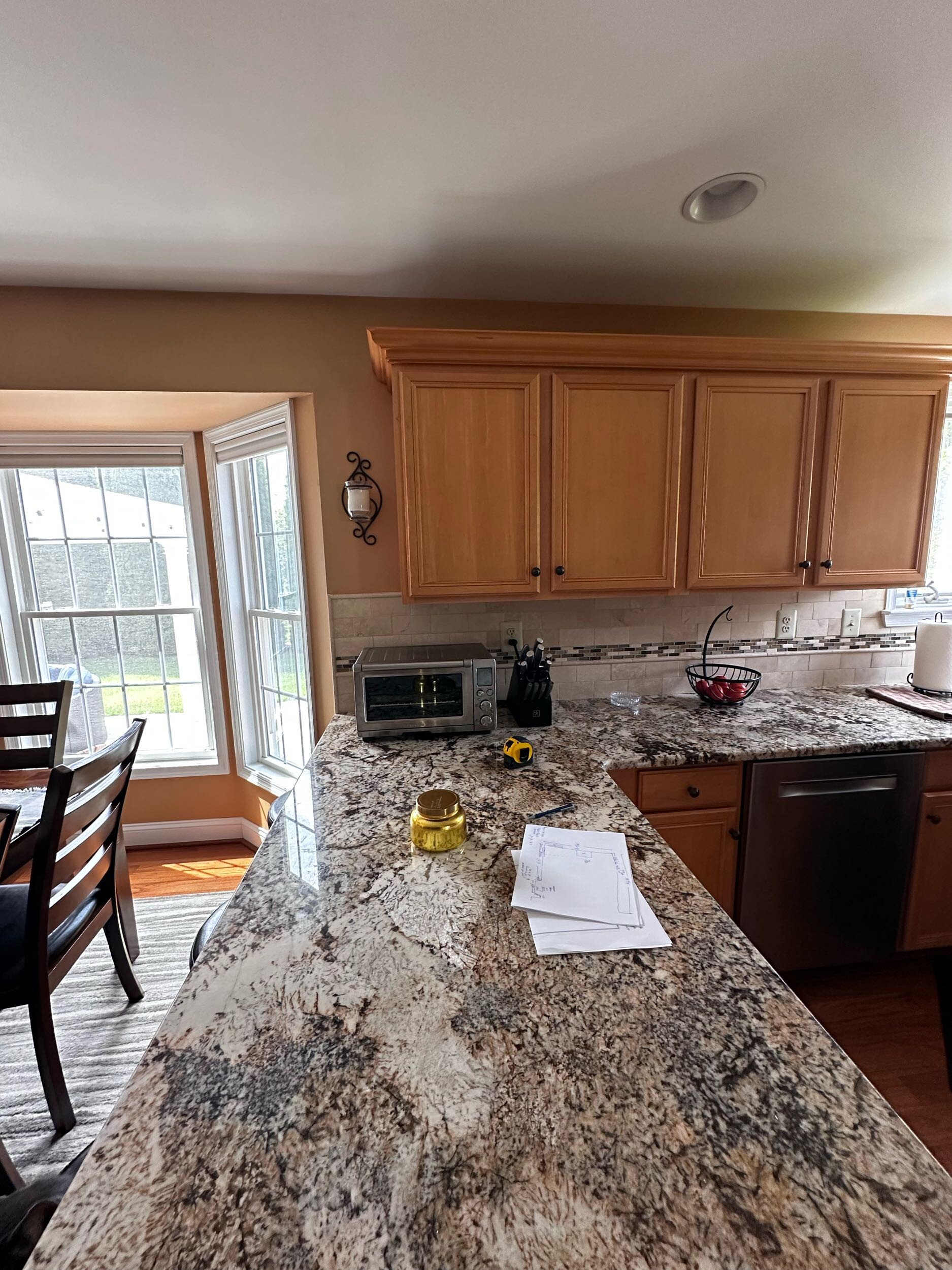
The original kitchen had:
- Heavy, patterned granite that visually weighed down the room
- Golden maple cabinetry that absorbed light rather than reflecting it
- A dated tile backsplash and traditional peninsula layout
- Limited prep space despite plenty of square footage
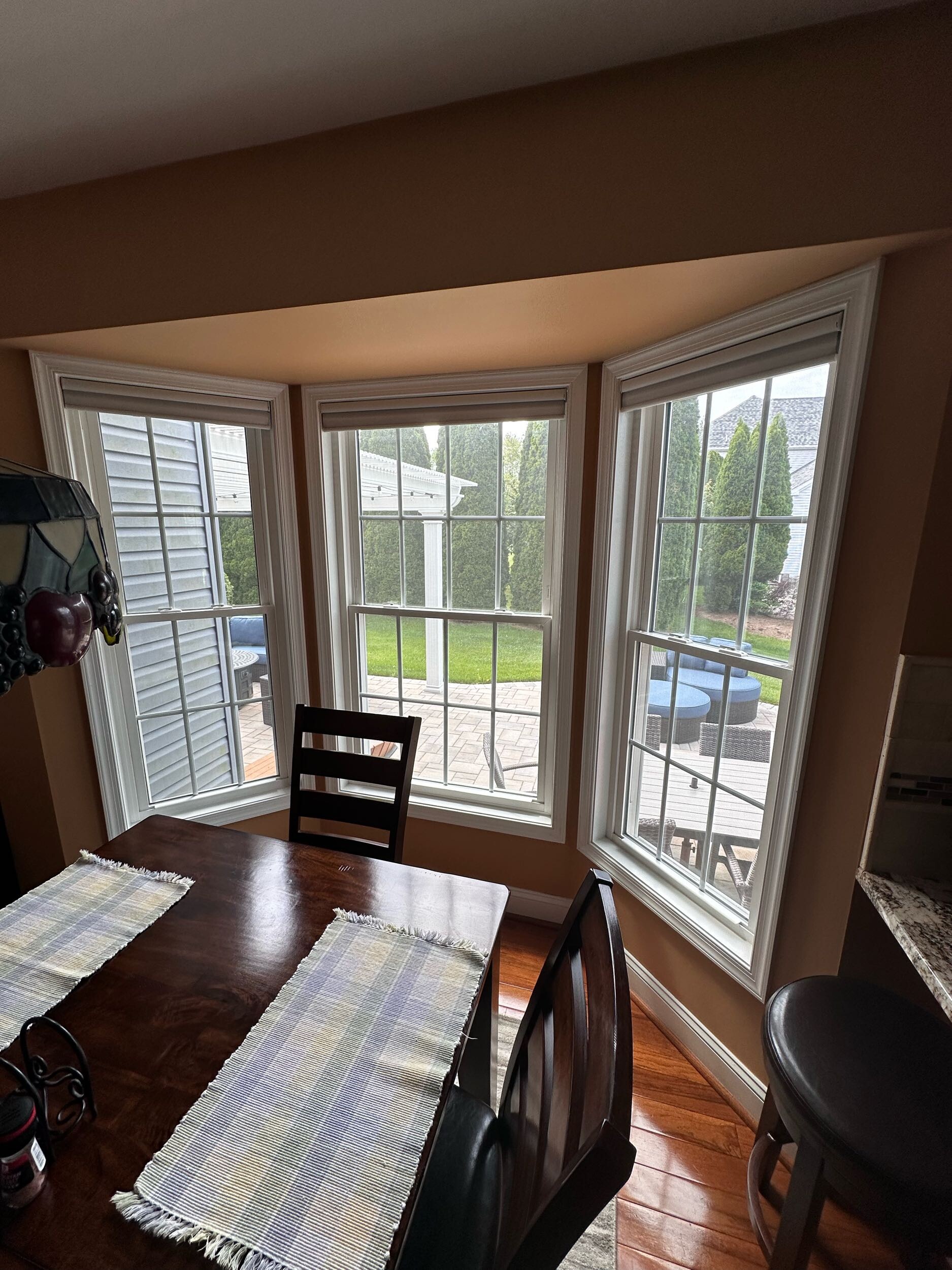
- A window wall that offered great light—but wasn’t being visually maximized
From that conversation, a clearer dream emerged:
A brighter, white-based kitchen with clean lines, softer contrasts, enhanced storage, and a beautifully functioning island in place of the old peninsula.
Design: Visualizing a Lighter, More Functional Space
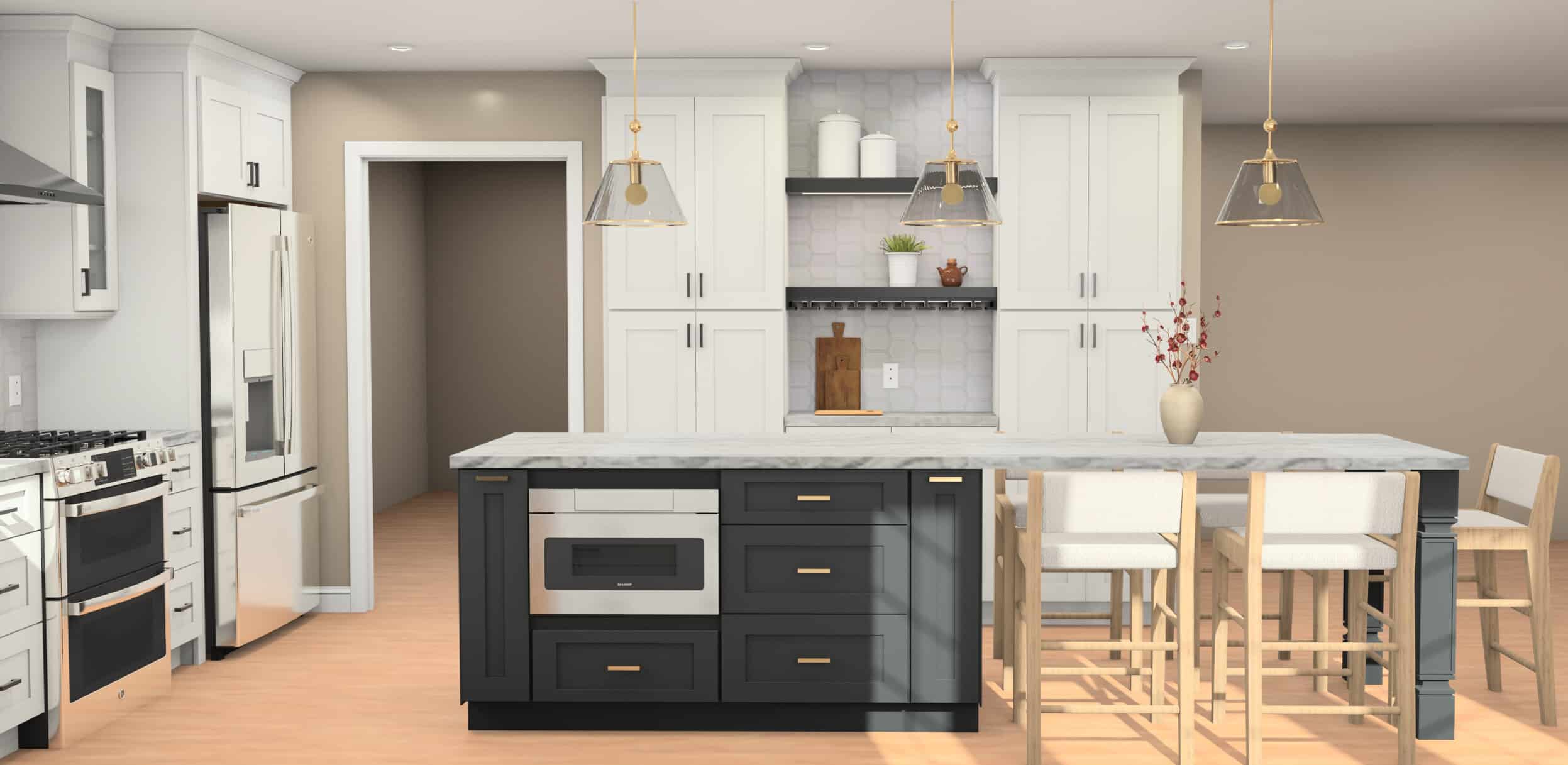
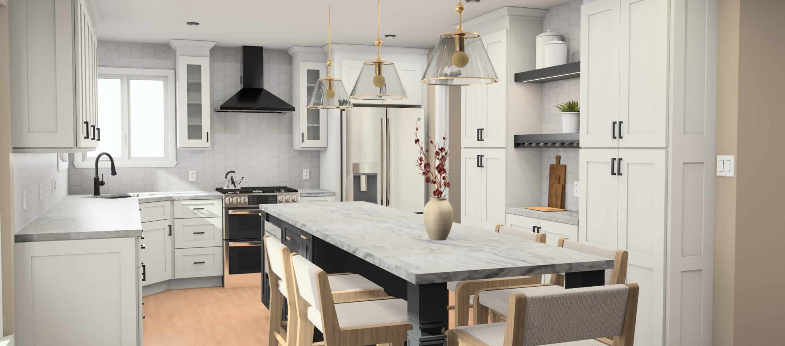
Once the wish list was defined, our design team created photorealistic 3D renderings that allowed Rick and Sharon to step inside their future kitchen long before construction began.
Key design decisions that took shape in rendering:
- A central island replaced the old peninsula, immediately creating better movement and gathering space.
- White perimeter cabinetry brightened the once-heavy room and helped maximize natural light.
- A rich, dark island base grounded the space, adding character without overpowering.
- Glass and brass pendants brought in warmth and elegance.
- A new feature cooking wall with a black hood, fresh tile, and glass-door uppers added focus and symmetry.
- Two new floating shelves created a coffee and display zone for Sharon’s blue-and-white pieces.
- Updated hexagon tile backsplash introduced subtle texture and a modern feel.
These renderings became the roadmap for the final design set.
Build: Watching the Transformation Happen
Construction took place from August 13 through October 28, and each stage brought the vision closer to life.
As the build progressed, each detailed element unfolded:
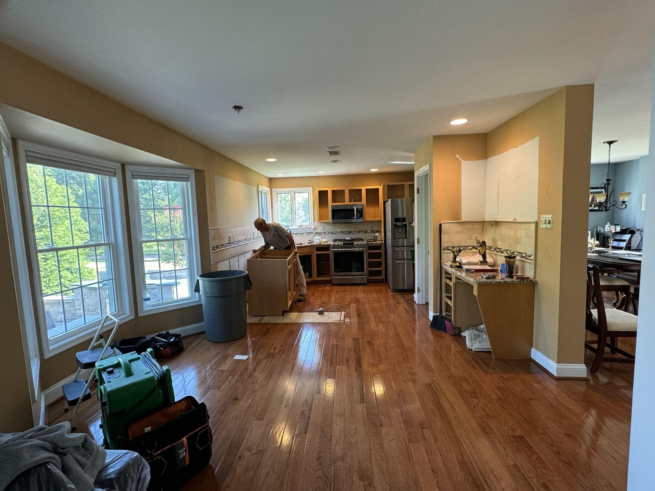
Step 1: Careful Demolition
The first few days focused on removing cabinetry, countertops, backsplash, and the peninsula while protecting existing floors and windows.
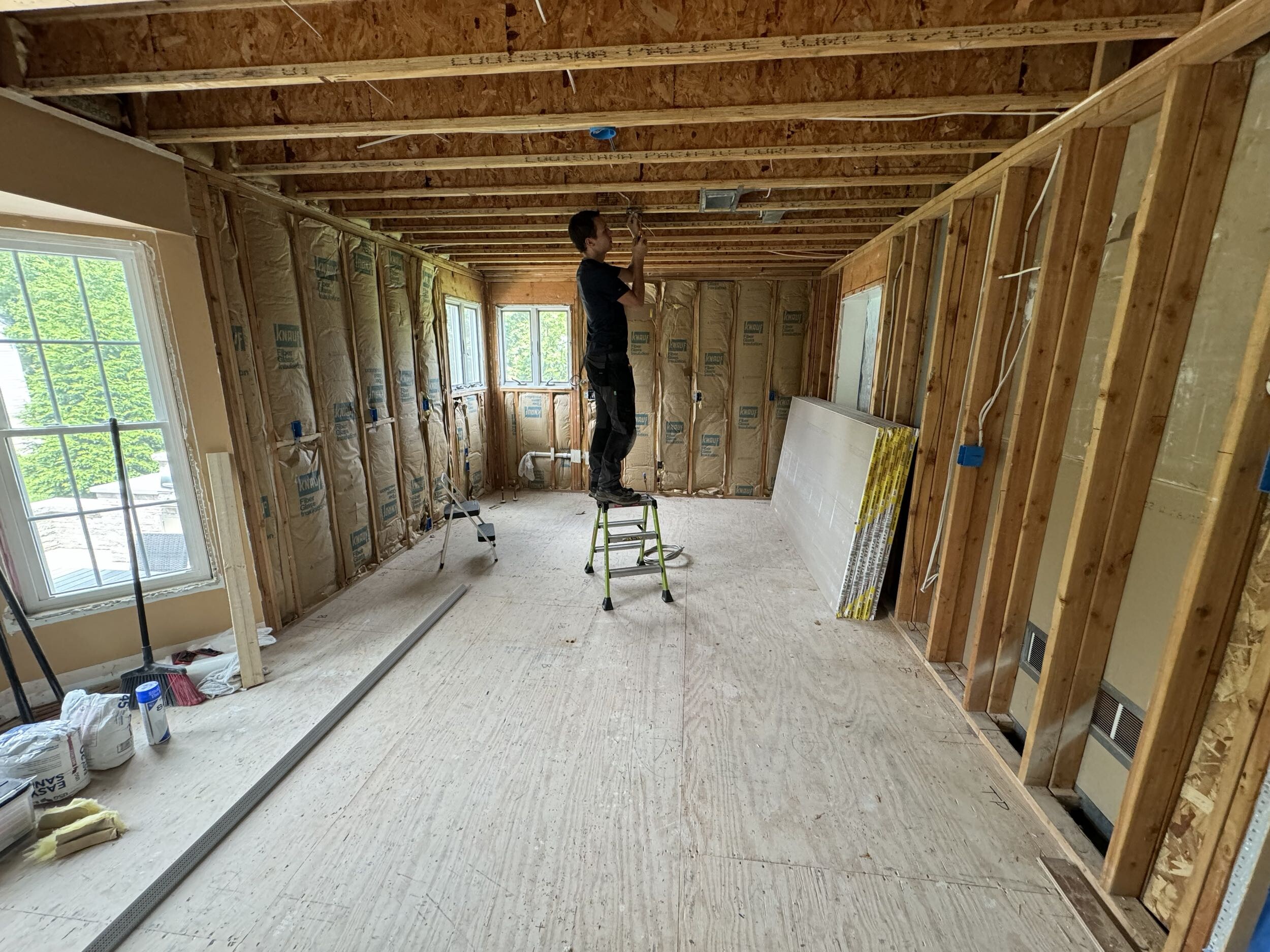
Step 2: A Clean Slate
Once everything was stripped back, the team opened up the walls to update electrical runs, prep for new lighting, and ensure the new cabinetry layout fit perfectly.
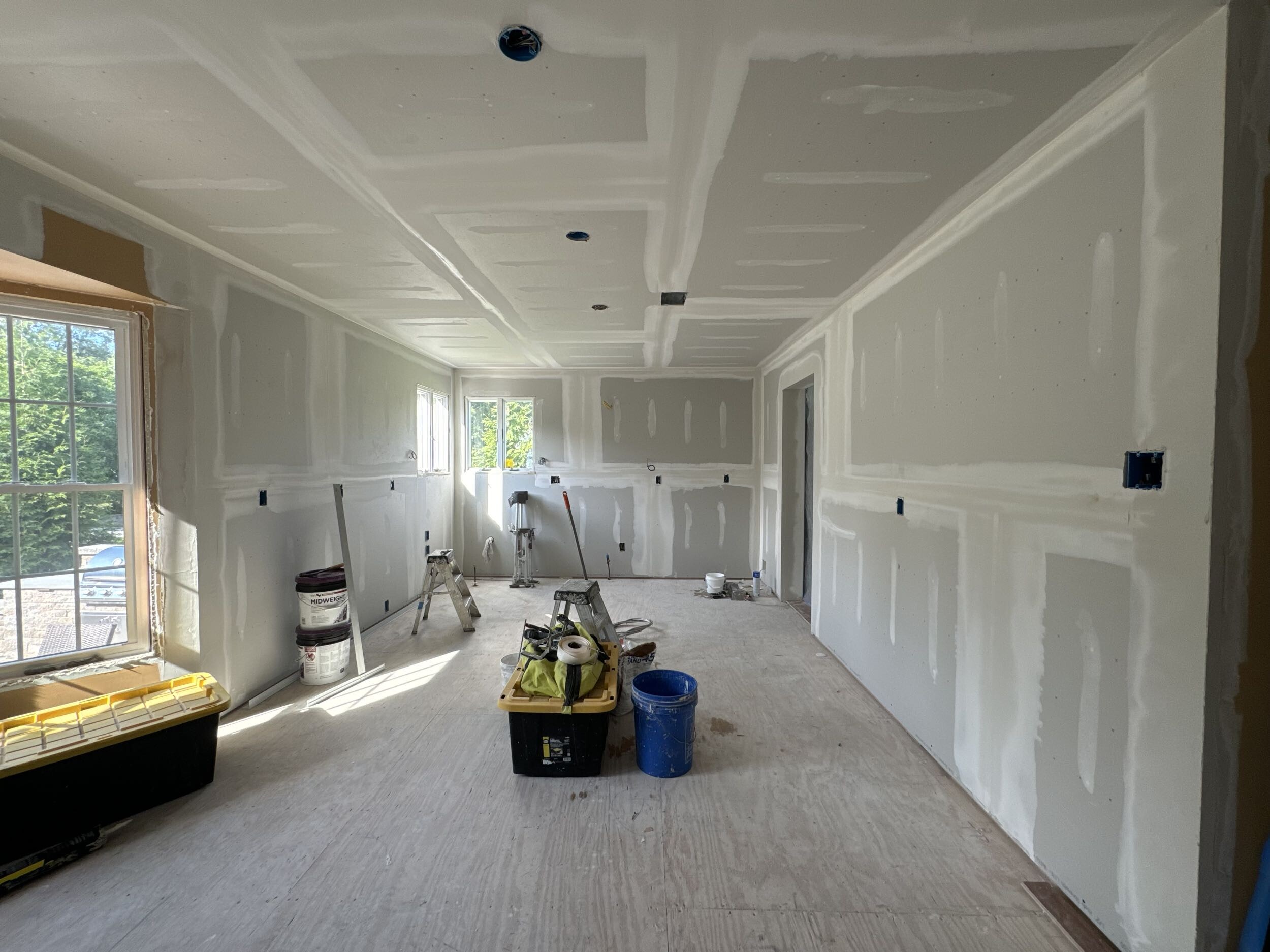
Step 3: New Drywall & Fresh Foundation
The entire room received new drywall finishing to prepare for tile, cabinetry, and paint.
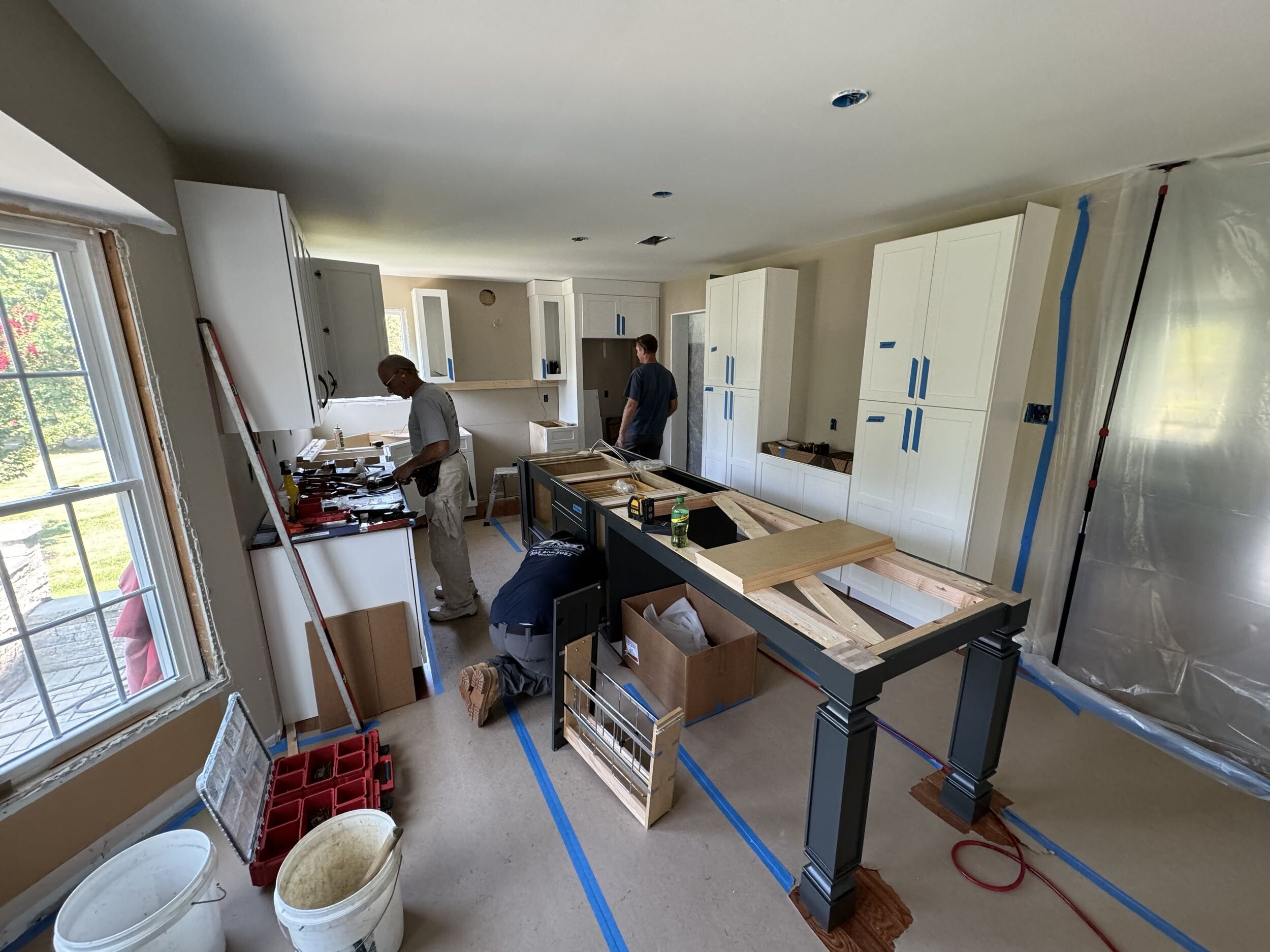
Step 4: Cabinetry Takes Shape
Next came installation of the white Dura Supreme perimeter cabinetry and dark island base. Storage immediately increased, and the space felt larger even before counters went in.
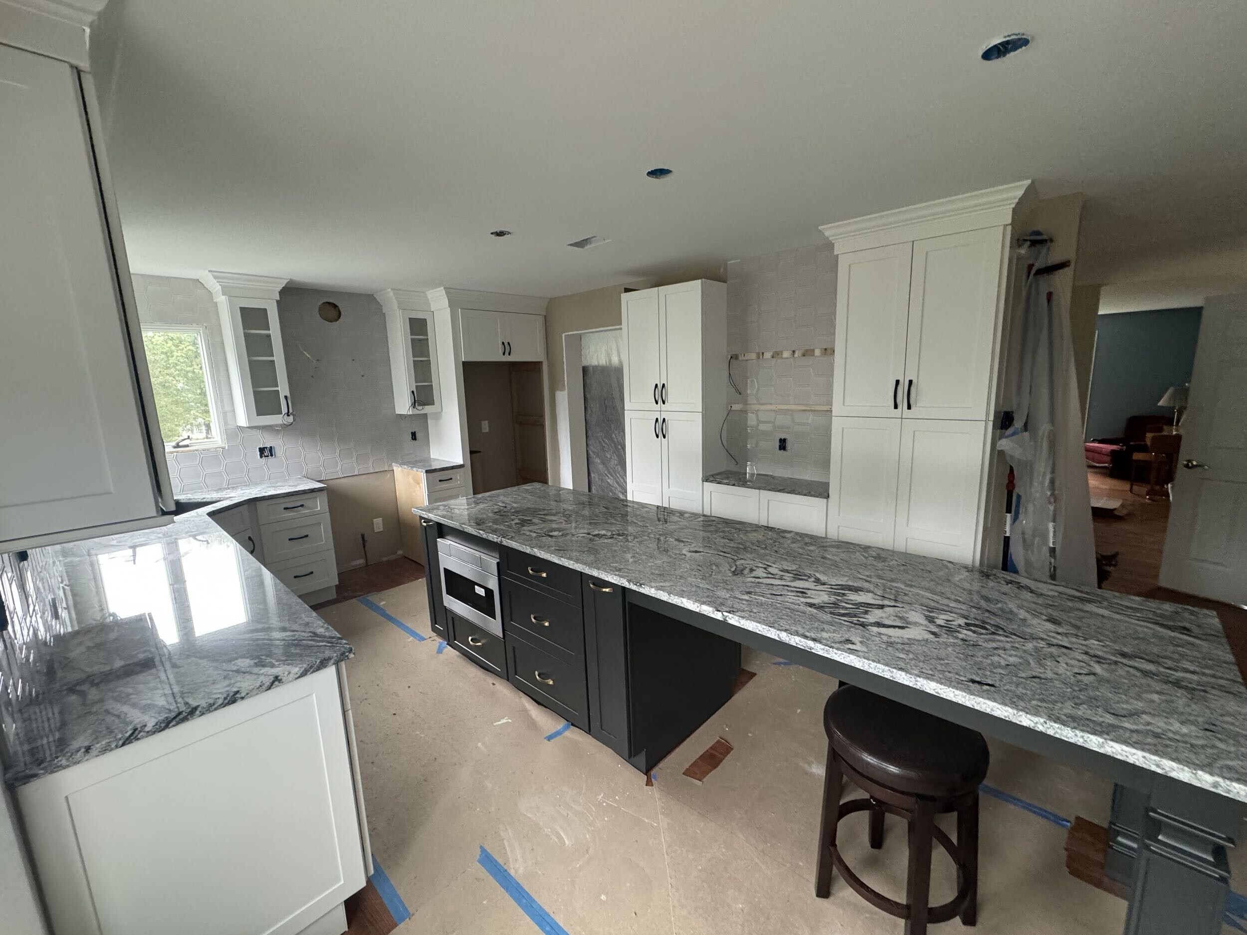
Step 5: Countertops & Backsplash
A stunning neutral granite—soft greys, whites, and charcoal veining—was installed across the perimeter and the island.
The backsplash followed, using a hexagon tile with a soft sheen that catches the light beautifully.
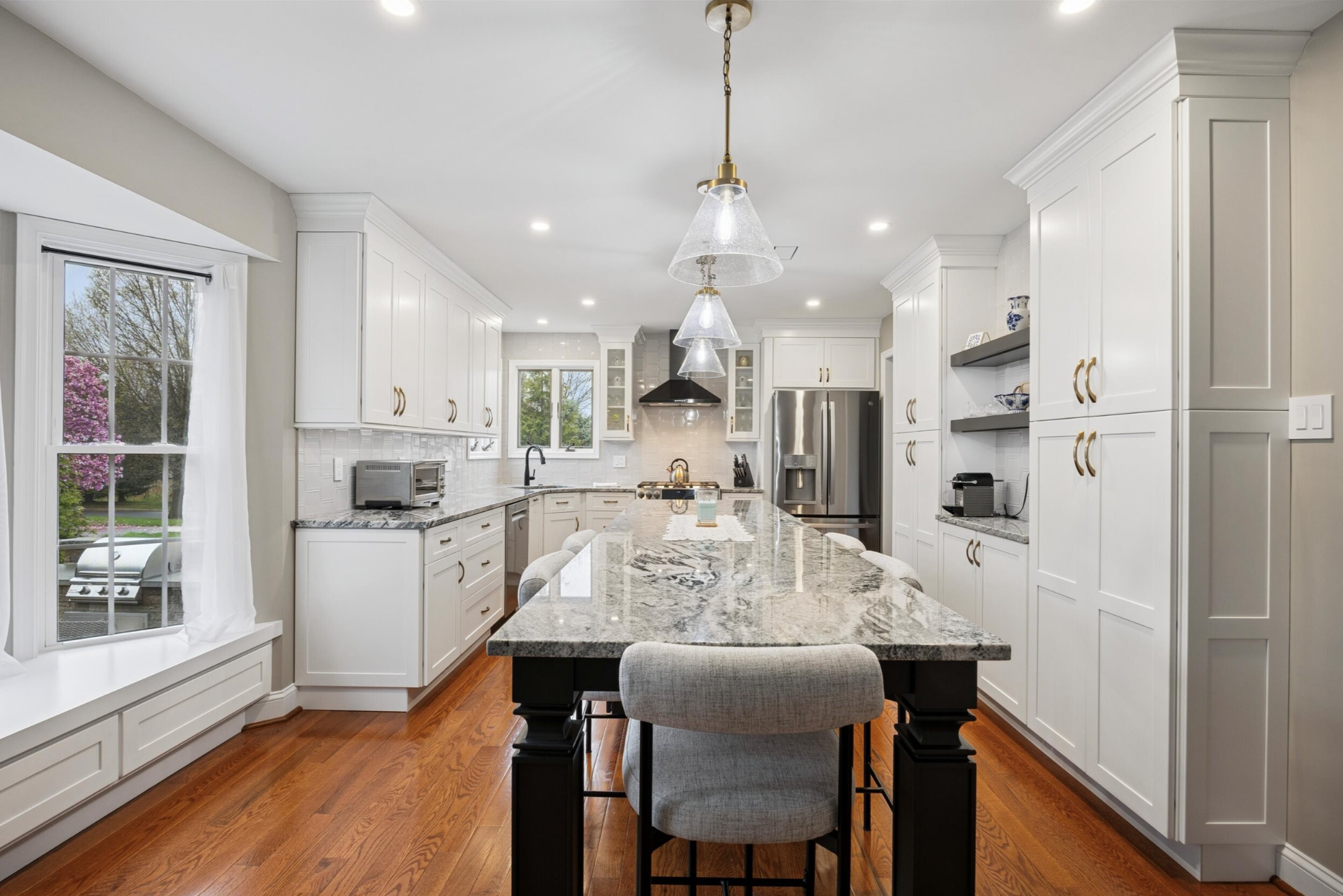
The Reveal: A Brighter, Smarter, More Welcoming Kitchen
By late October, Rick and Sharon stepped into a space that felt fresh, calm, and completely transformed, without altering the footprint of their home.
What Their New Kitchen Now Features:
- White perimeter cabinetry that bounces light and creates a spacious feel
- A dark, furniture-style island with seating for four, integrated microwave, and additional storage
- New cooking wall featuring a black range hood, glass-door uppers, and a modern hexagon tile backsplash
- Floating shelves that balance the pantry wall and create a display-worthy coffee zone
- Brass hardware and lighting for warmth and contrast
- Updated granite countertops with serene veining that ties the whole palette together
- Full ceiling lighting plan with recessed lights + statement pendants for layered illumination
The room, once visually busy and boxed in, now feels open, seamless, and serene.
Why This Remodel Worked
This project is a perfect example of how strategic updates, thoughtful finish selection, and smart layout changes can completely redefine a space without tearing down walls.
Rick and Sharon now have:
- The island they always wanted
- A brighter palette that makes the room feel bigger
- A high-functioning layout rooted in everyday use
- A kitchen that looks modern yet timeless
- A space that feels more like their home than ever
In Garnet Valley, this kitchen remodel shows just how transformative a well-planned design-build process can be.
Begin Your Own Kitchen Story
If you’ve been dreaming about a kitchen that connects, and delights, we’d love to talk. At First State Building & Design, we partner with you from the dream to the final detail, so your home doesn’t just look better, it feels better.

Hours of Operation
Monday thru Friday: 8:00 AM to 5:00 PM
Saturday: By Appointment
Sunday: Closed
Contact Us
Visit Our Showroom
258 Wilmington Pike
Chadds Ford, PA 19317
Areas We Serve
Pennsylvania
Bucks County
Chester County
Delaware County
Montgomery County
Delaware
New Castle County
Maryland
Cecil County
Memberships


